Wednesday 31 January 2018

Character Design Process: Milton

The last few days, I have been designing my 'narrator' character. I wanted this character to be as simple and shape-based as possible. This way it wouldn't take away from the 'relatable' aspect of my book (if I had a person, readers who didn't look/act like that person might not relate). No one relates to a blob, so - in theory - none of my potential readers should be made to feel that the book isn't for them due to the character design.

I scribbled a few random shapes, then built them up into design sketches. I then posted these sketches on the Comic Nest page for feedback from my target audience.

Below, you can see my final design sheet for my character: Milton! I chose this name for the same reason as choosing to make him a shape - Milton is rare enough of a name to not be all that relatable to one group of people specific. It's also memorable! There are some notes on the page of why I decided on some design aspects.

Personality wise, I felt it was important to make Milton as 'cliche student' as possible, really exaggerate some student stereotypes. So, I have him being very dazed, dorky and confused -looking. This informed his design, particularly in his facial features. His eyes are very empty, and lined and darkened, and he's got a quirky wonky tooth.


Monday 29 January 2018

Social Media Posts - 29/1


Today I posted about my initial character ideas. I added a question to each of my posts to make our followers feel involved in the production of my book. I took it at an angle to make it a little more interesting.

Sunday 28 January 2018

Social Media - Creating Accounts and Start-Up

Social media is a crucial part of modern marketing, and a part of this project that I - as someone who works in social media - felt especially drawn to. As soon as our name and logo were confirmed, we began looking into setting up accounts. We chose to make four accounts altogether - an email (for professionalism, and so we had something to set-up the social media accounts with), a Facebook page, an Instagram and a Twitter. We felt these were the most important, as they were the most popular among are target market.

Though two of us were setting up the accounts, we ensured we were talking whilst we were doing it to make sure we kept a strong theme and house style between them. This was important for solidifying our online brand. We did encounter a slight hiccup when we found that the simple @comicnest handle on Twitter had been taken, whilst it was free on Instagram. We chose to use the Instagram one, as the opportunity to have something so easy to find was too good to miss, then added an underscore to the Twitter handle and chose to make extra clear on other accounts that the Twitter was this way.

We decided that we wanted a very personal cover photo for Twitter and Facebook, that featured self-portraits of each of the members. Not only would this would this give the viewers of our pages an immediate insight into each member's style, but we could later use these drawings for our individual introduction posts.

However, in the time between making the pages and finishing the cover photo the top of our Twitter and Facebook were blank, which didn't look very professional. Due to this, I decided to throw together a quick temporary cover photo consisting of our logo and our social media links as a place holder (below).
Katy found a texture to use on the final cover photo (below) behind our portraits, and then I added this and the logo to every member's portraits for their intro posts, so we kept our strong sense of house style.


Another way we made sure to keep our group all connected to one another was how we arranged our Instagram introduction posts (right). As we only have five members, we worried that the intro posts may look jarring on our page (as Instagram is organised in lines of three). To combat this, we decided to post our logo in the centre of the bottom row, and draw all of our self-portraits to have them look at the logo. I really love how this turned out!

Our posting schedule was planned out before we posted our introductions to make sure we were consistent in our posting. We organised that each of us would cover one weekday, and then weekends would be reserved for any general group posts. The order we chose was decided on based on which days we were free to produce the most work: -
- Monday: Me (Birb).
- Tuesday: Daniee.
- Wednesday: Katy (Selkie).
- Thursday: Alex (Stars).
- Friday: Meg (Ties).
(Our tag names were based on our personal art handles, as some of the group already had large followings on social media.)


Friday 26 January 2018

Idea Development

I've decided to settle on the second of my two options - a sort of self helps book. Specifically, a humorous life hacks book aimed at students. I chose this because I felt I knew more on this subject, than I did on cooking as I work as a student blogger so have to keep up-to-date with these kinds of things. I felt it was important to play to my strengths within this project, as taking a risk may severely impact my sales.

I chose to market my book at students, specifically, as I found that there is a lot of humour on the internet centred around the struggles of living away from home for the first time. It comes across that students tend to do a lot of silly things (possibly due to the fact that they're having to live alone before their ready, compared to people who choose to move out in their own time), and like to be reassured that they're not alone in this. As a student myself, I definitely feel this way!

I mentioned in my last post that I was considering including one character in my book, to add to the 'brand' of the product. I have now decided I'm definitely going to do this! I intend to include a cute, simple, student-based character as a sort of narrator for my book. Not only will this add to the brand, but cute, gimmicky characters (see; Minions) tend to sell well to my young audience, and this will also help me to clarify some points in my book through this character.

Tuesday 23 January 2018

Branding Lesson

Today, we had a lesson on understanding branding and marketing. This is obviously absolutely crucial for this module. We were given two prompts - a noun and an adjective - and we had to produce a brand for the item.

We were given "comfortable toilet bleach", which is a huge contradiction. But we did our best and came up with the idea below:


This was 'Velvet Wave' - words we felt connoted softness and cleanliness. Our bottle was cute and pink and we ever created a little toilet mascot to go alongside our liquid-drop character. I was really happy with this task!

Friday 19 January 2018

Initial Ideas

When coming up with initial ideas, there were two things I felt were most important to keep in mind - our group theme, and our target market. To an extent, these things go hand in hand, as we chose our theme based on the interests of our target market.

Still, I did a little more research in the traits of the attendees of MCM and similar cons and their buying habits (links on this can be found at the bottom of this post, or in my useful links post). I found that a lot of the thoughts I previously had on the subject were just confirmed by this research. I concluded that my target market: -
- Have very little money.
- Like content they can relate to.
- Like references to things they enjoy.
- Have a strange sense of humour (*internet humour*).
- Like trends and fads.
- Love memes.
- Like cute things.
- Like things that don't take too much concentration/time.
- Are usually very busy.
- Use media around them as an escape from the less-than-positive current state of politics and the economy.

I used this information, along with a few casual conversations I had with members of my target market, to establish I wanted to do a non-fiction book, specifically something helpful aimed at young adults. I chose this as I wanted to play to the 'relatable content' and easy, quick reading points from my research. I also thought that choosing to create something non-fiction will potentially make me stand out against a lot of other books in the Comic Village at MCM.

My first thoughts of where to take this idea are a cookbook or a sort of self help book. This is something I will have to consider over the next few days. But I do know that the style I'd like to approach the product in will be similar to 'The Meme Bible' (thememebible.com) - a spoof activity book that's very popular in my target market. It's very simple and lighthearted, and really plays into its readership's strange sense of humour.

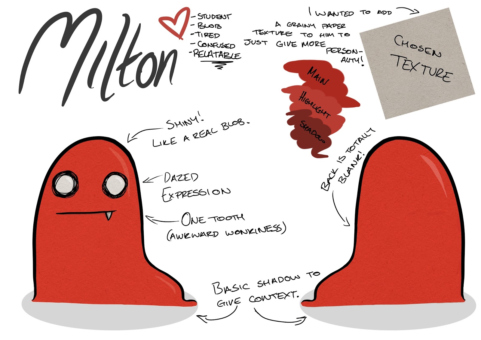
Another thing I will need to consider is if I want to bring any characters into my book, just in the interest of creating a stronger brand for my product.

Links:
Millennial Shopping Trends - blog.marketing.rakuten.com/affiliate/9-must-know-millennial-shopping-trends-of-2017
Millennial Infographic - goldmansachs.com/our-thinking/pages/millennials
Making Millennials Spend More - https://www2.deloitte.com/content/dam/Deloitte/uk/Documents/consumer-business/deloitte-uk-young-luxury-shopper-2017.pdf
Millennials on Millennials - http://www.nielsen.com/us/en/insights/news/2017/millennials-on-millennials-a-look-at-viewing-behavior-distraction-social-media-stars.html

Thursday 18 January 2018

Choosing a Logo

The logo was another element of our production house planning that I felt was absolutely crucial to the success of our group. We wanted our logo to communicate our theme, whilst being simple enough to use in a variety of places (not take away from art on covers, for example), and still be memorable.

Once we decided on our name, we chose to repeat our 'a week to throw out as many ideas as possible' idea. These were my contributions:

This (right) was the idea I spent the most time on. I came up with the concept during a group discussion of merging imagery of birds and comic books. While I did really like this, I think it lacked the cuteness we were looking for in our logo and came across more academic than artistic.

Below, shows my more typographical ideas. I chose to experiment with these, as I personally tend to be more minimalist in my approach to design tasks. Again, though, I felt these designs were a little to bold and harsh, and didn't have the fun element we were looking for.

Once our brainstorming week was complete, we each picked our two favourite designs of the week, and these were compiled into a poll to see which was most popular in the group. I chose Katy's 'heart wing' design (A), and Alex's 'bird kiss' design (E). I felt they were both clear, whilst still being very cute!


Katy's design (A) came out of the poll as the clear favourite, but due to it being just a basic sketch we all agreed it would need some revisions and additions. Meg and I then set to adding typography and messing around with the style of the art. These experiments can be seen below, and eventually led to Meg arranging the typography in a way we all loved (top left of the below screenshot).

With a couple of revisions and the addition of the extra hearts to help the balance of the logo, we came to this:

We started another poll to check if everyone was happy, or if they wanted to keep fiddling around to see what we could find, and everyone unanimously voted to keep it as it was.

After this, I sent the logo to a friend to get an opinion from someone who was in our target market and had no preconceptions of the group. Not only did he have a positive response to the logo, but he also suggested an idea for each of us to make it our own by changing the colour of the heart. I made some mock ups of these to check the group's opinions and they agreed it was a nice idea to give each member individuality, whilst still appearing as a strong collective.


Wednesday 17 January 2018

Choosing a Name

When choosing our name, we wanted to explore as many options as possible. This was due to the fact that we were aware that our group name was going to be one of the first impressions our audience had of us, so we respected the importance of it. We spent a week or so brainstorming ideas and throwing out ideas of words relating to our 'cutesy' theme. Towards the end of this week, Katy mentioned using the word 'nest', as it had connotations of home and family.


At the end of this week, we hadn't come up with anything we preferred, and so set up a poll to see whether we were good to go with Comic Nest, or continue searching for a better name. Everyone voted for Comic Nest (though, a couple of us voted to keep looking just in the interest of keeping an open mind if anyone came up with things in the next few days), and the decision was made. 

I really love Comic Nest as a name. I find that it's memorable, fun and unique. We also chose to check up on social media and Google before settling on it to ensure other companies weren't using it (making it easier for us to appear in Google searches).

Tuesday 16 January 2018

Choosing A Theme

The first group task we had was to find a theme for our publishing house. Our initial consideration was ensuring we found a theme that every member could work to and make the most of. Each member of the group had a different priority when choosing a theme, and my personal priority was finding a theme that sells well, and one that I'd noted selling well at previous MCM Comic Cons.

We began by brainstorming things we were individually interested in, and looked for crossover, but we found that this left us with options that were very specific. My initial suggestion was the general theme of animals, as I knew this would be accessible for a lot of customers. This developed into the theme of 'cute'.
I later did more research and found that 'humour' sells particularly well at conventions ran by the same people who run MCM. Evidence of this can be found here - http://comicsbeat.com/wp-content/uploads/2015/01/convention-survey-zine-2014.pdf

This, alongside the general progressions of our individual stories, lead to our theme developing into a sort of 'easy reading', quick, simple, happy stories. Easy to read and digest, and move on from.